HOW WE GOT THE LOOK
Folsom Bonus Space
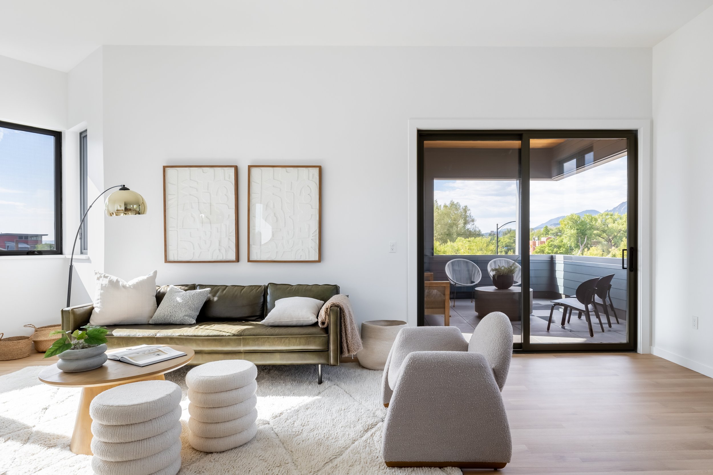
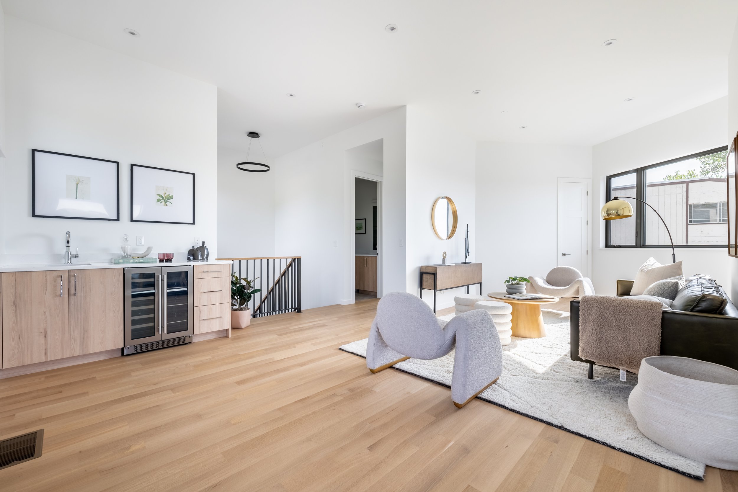
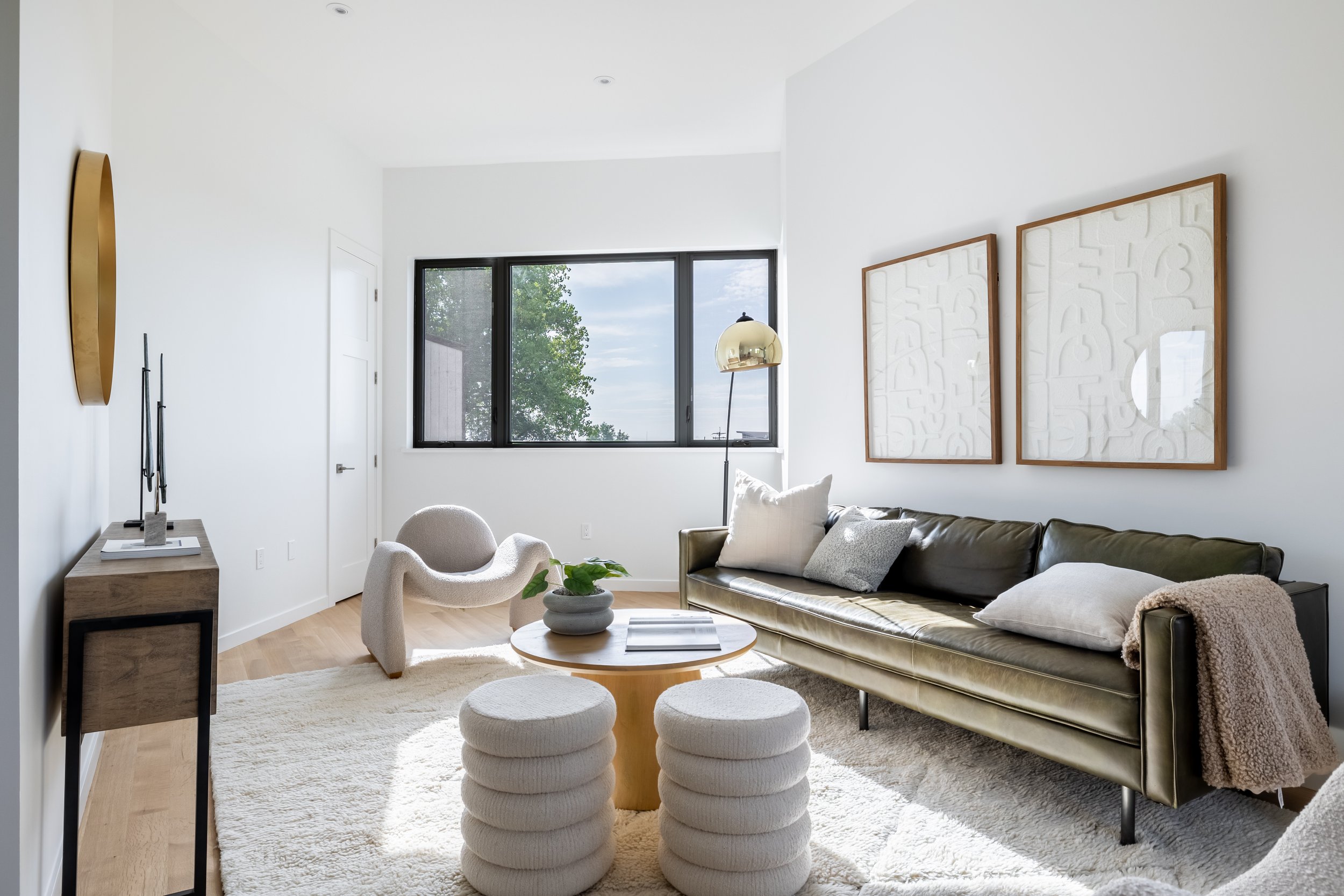
This third floor bonus space was so architecturally beautiful with its unique angles and high ceilings, but it made for a tricky staging project in terms of creating a space that was cohesive for buyers while still showing the overall function of the space. We knew we wanted a funky, cool, elevated feeling, so we brought in some fun elements such as these edgy accent chairs and the green leather sofa. The light/fluffy rug helped to ground everything while also providing a cozy feel. We had actually planned on more of an L-shaped layout with the two accent chairs next to each other, but when we started arranging everything, it just didn’t feel right. When we placed them across from each other it solved one problem but created another — the coffee table felt a little lost. We intended for the boucle poufs to go under the window but combining them with the coffee table not only solved the issue, it made the space feel way more special. Styling a room is truly a combination of planning and also making changes on the fly. Just because you had a certain thing in your head, doesn’t mean you have to stick with it. Have fun and try out a bunch of different options!
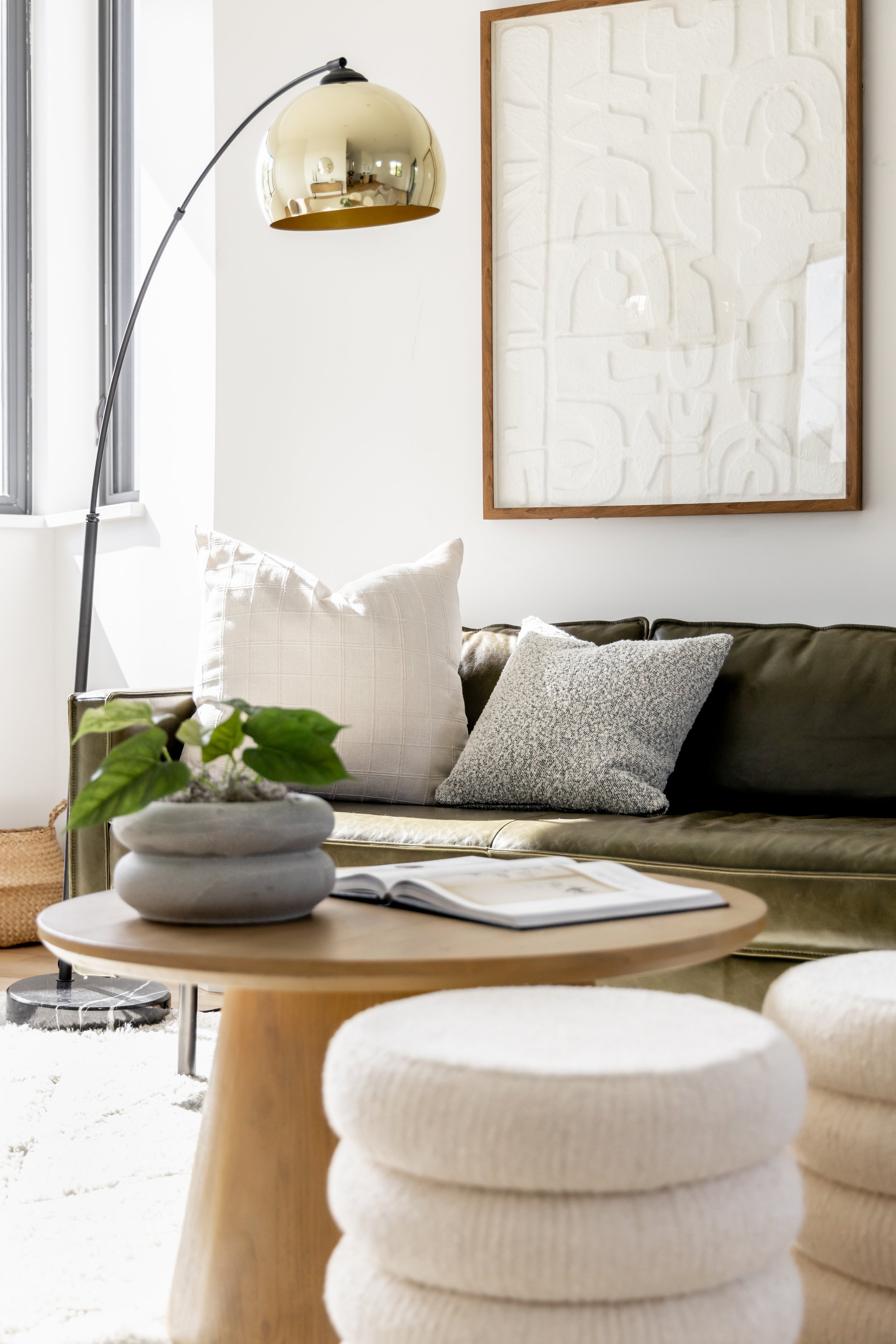
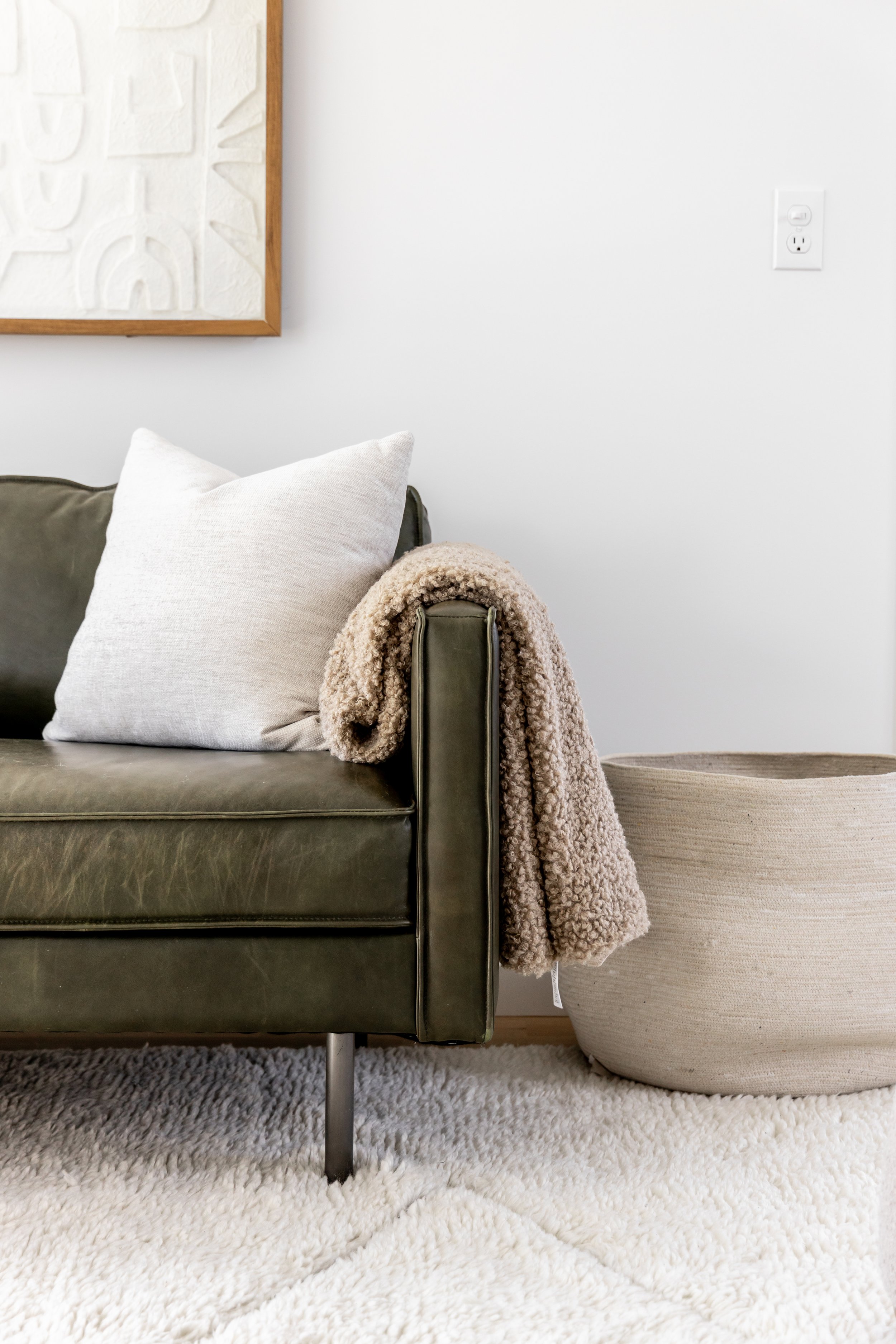
One of our favorite things about this look is the mix of materials. We used leather, wood, boucle, metal, wool and rattan — which helped to give it a high-end feel. Something else we love to do is combine high-end pieces with more affordable items. While we utilized a high-end sofa and accent chairs, we also chose some great neutral pillows from Target.
Fun side note: Someone clearly sat on the sofa and messed up the pillows before our pictures were taken. Kate has somewhat recovered…
Shop this space and more over on our LTK!
Let’s work together.
Do you need help on an upcoming listing or styling your own space? Drop us a line below!
