HOW WE GOT THE LOOK
15th Street Living Room
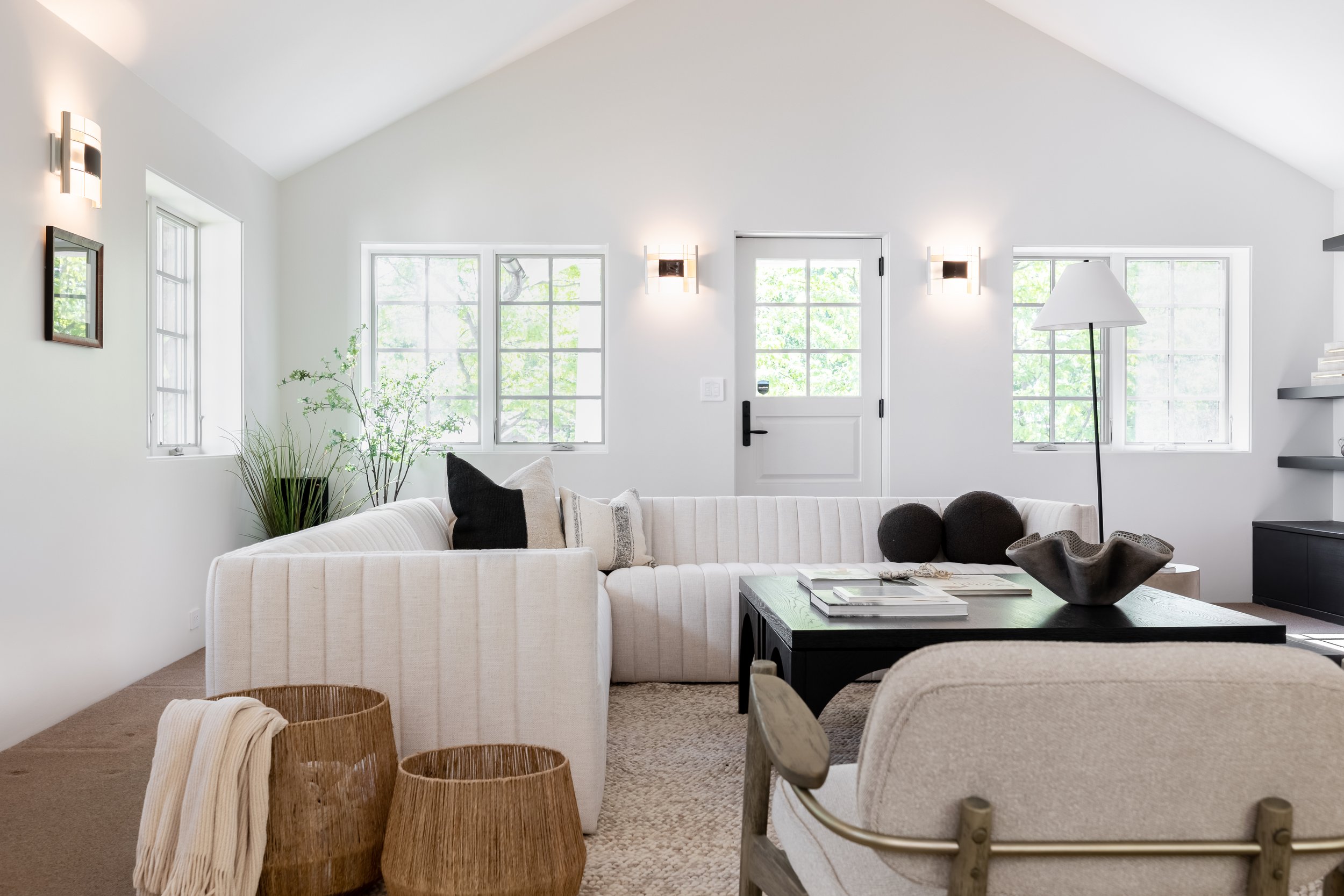
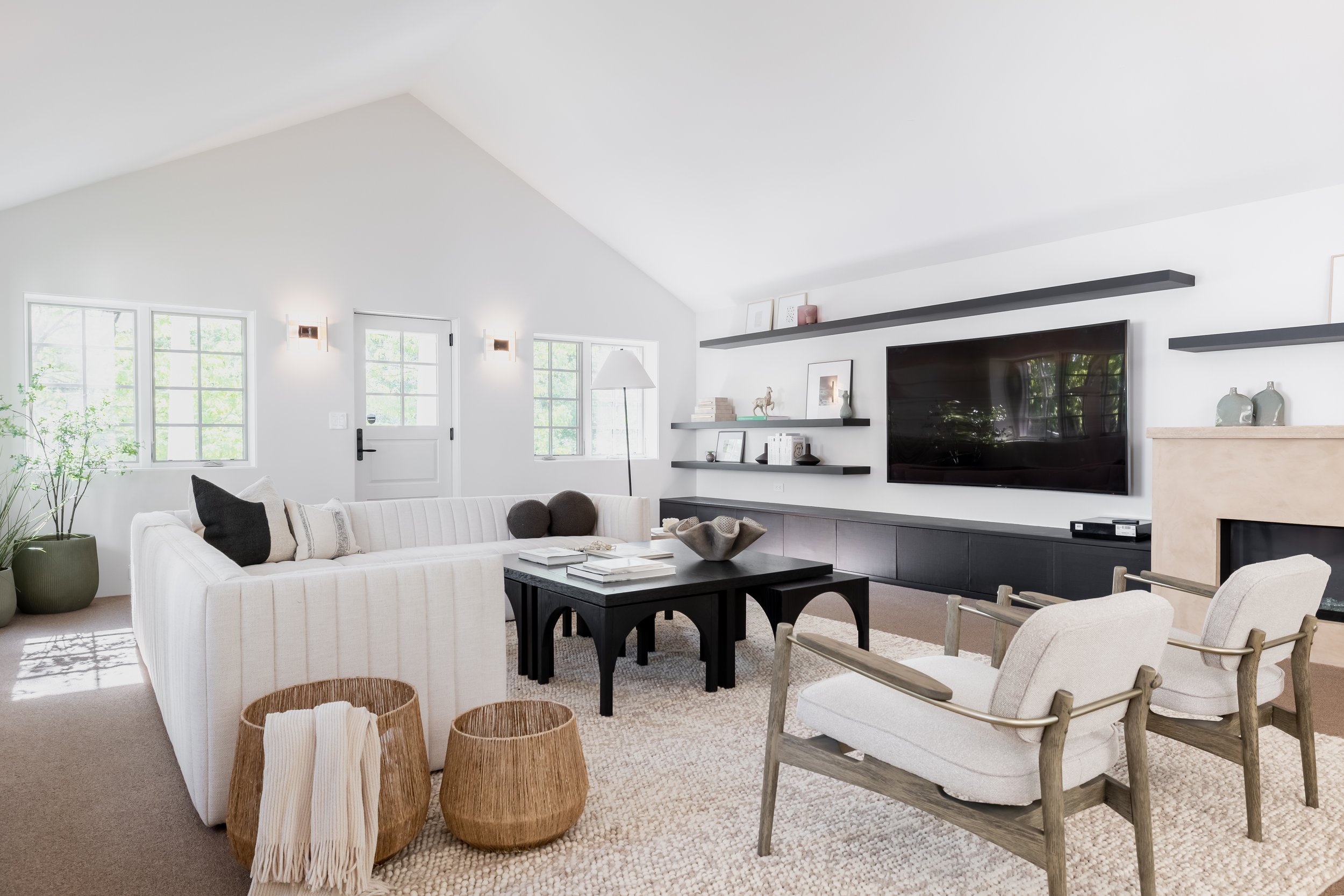
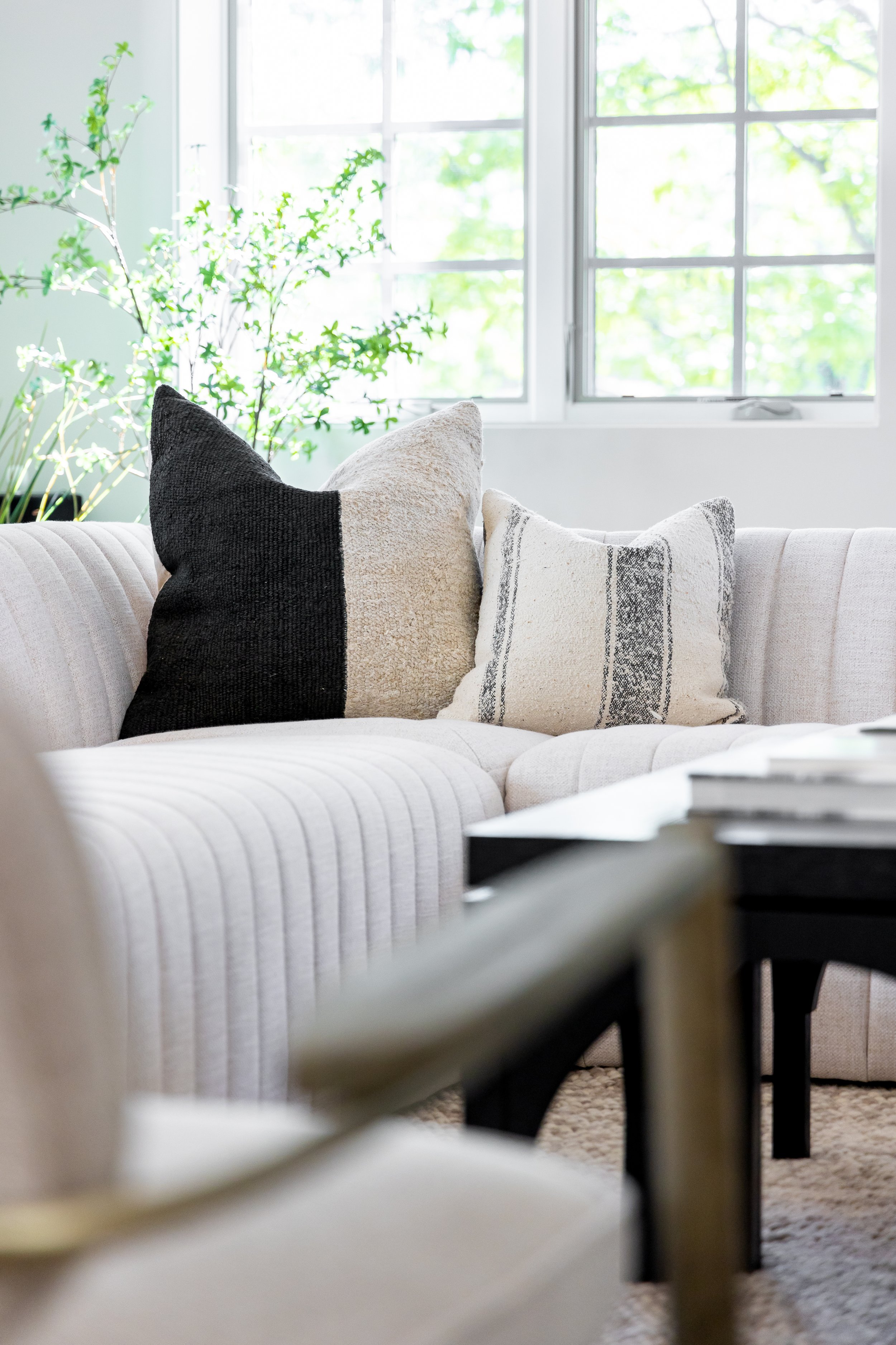
This listing had such an interesting history. The living room was actually the original structure, which was unable to be fully updated according to city codes. While it had some modern features such as freshly painted white walls, some elements were far from the modern aesthetic of the rest of the home, which had been added on in a massive remodel over the years. Our challenge with the space was making sure it felt cohesive with the ultra modern take on the rest of the staging.
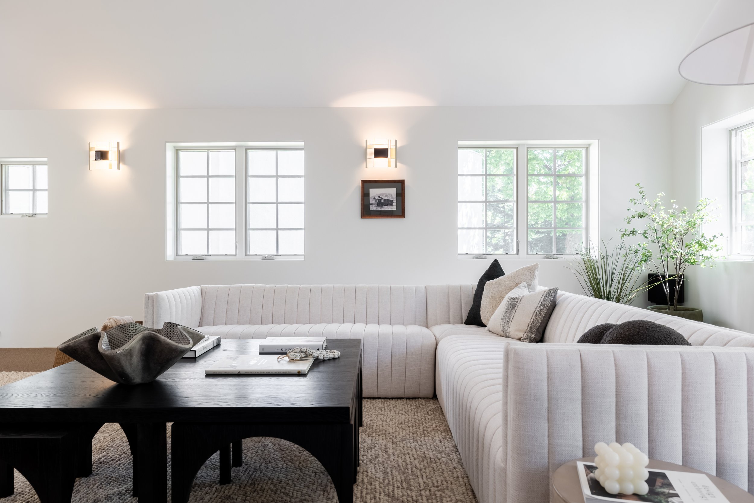
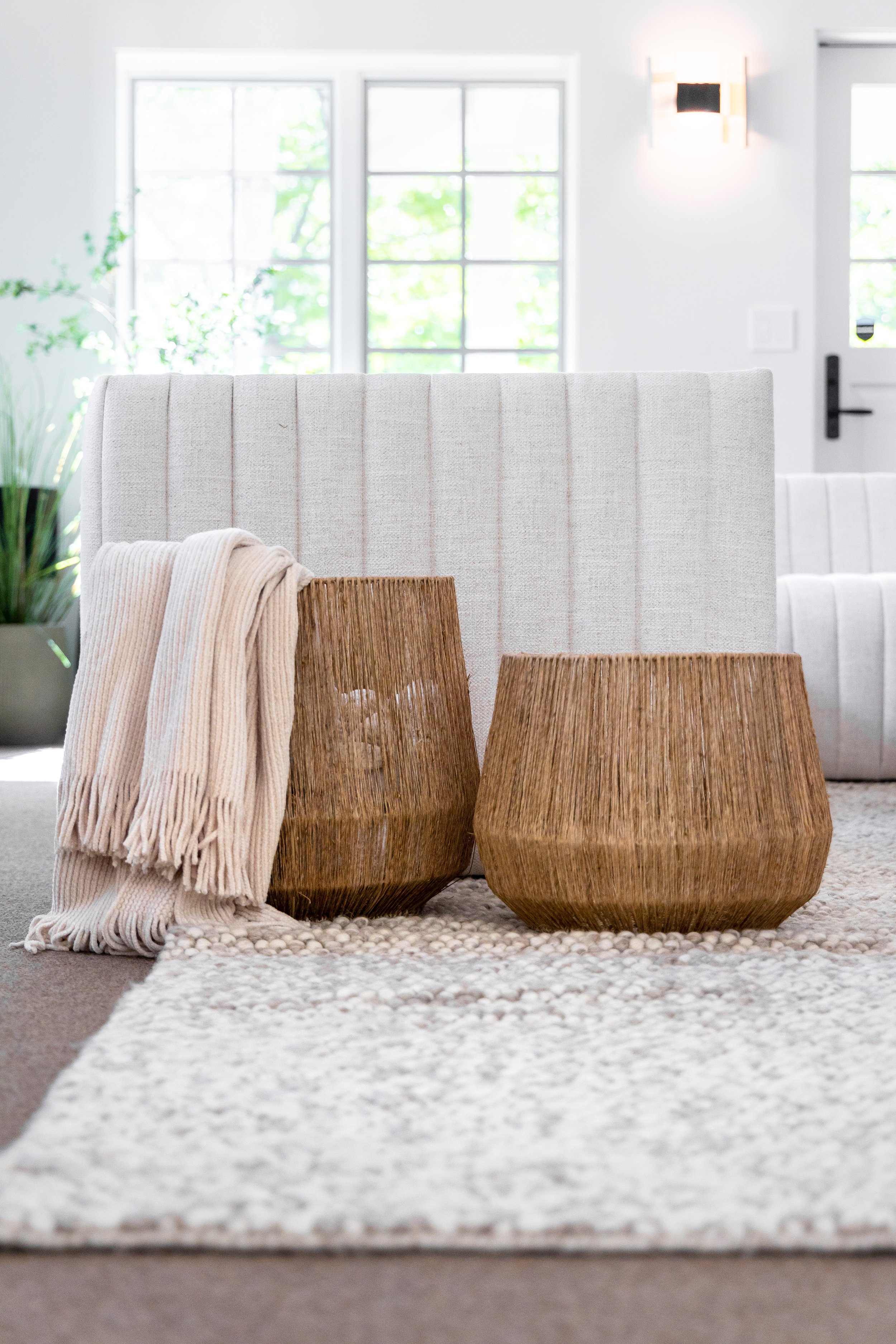
In thinking about how a potential buyer might utilize this space, we knew it would likely be the main ‘hangout’ space of the home since it was located directly next to the kitchen. Therefore, we wanted to make sure it felt elevated, yet approachable. We selected light, modern pieces that felt in line with selections from throughout the rest of the home, but also felt comfortable enough to sit and lounge, or watch a movie. We also loved the idea of an oversized coffee table — and even better, this particular coffee table includes little pieces that are tucked underneath for ultimate functionality. Additional touches such as the baskets/throw blankets, plants, etc really helped to make it feel approachable and cozy. <3
Check out our LTK for links to the specific products from this space.
Let’s work together.
Do you need help on an upcoming listing or styling your own space? Drop us a line below!
